Intern's Diary #1: Pantone Forecast 2013
Intern's Diary #1: Pantone Forecast 2013
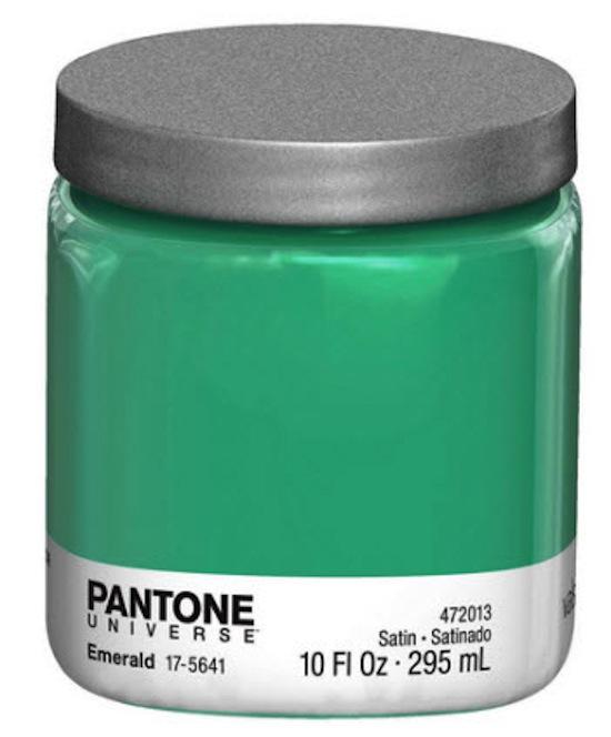
Pantone Emerald Paint
While we waited at Michael Janssen gallerie last week for John Baldessari to arrive (late, against all odds) at the preview reception, Meg Cranston, his work partner, filled us in on the collaborative pieces they had made for their show Real Painting (for Aunt Cora). The colors, she said, were intentionally selected using the so called: Pantone Fall 2013 color forecast; a project that helps identify the trending colors for the upcoming fashion season.
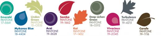
“Once you take a look at them, you’ll see them everywhere,” she mused, gesturing to the canvasses. As I looked at the bold, earthy tones of the forecast, I immediately regretted my decision to bring my sunny summer clothing along with me when I moved here from the States earlier this month. Should I dye my pastel shirts DEEP LICHEN GREEN, MYCONOS BLUE, or perhaps VIVACIOUS? Or black? Probably black...
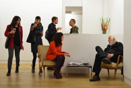
The artist had a point, though. Looking back through our WHAT DID I (NOT) MISS posts, I noticed there HAS been a prevalence of the Pantone palette marking the art world. Not by coincidence, Meg Cranston was seen dressed in a KOI jacket with matching ACAI tights and shoes. An unapologetic John Baldessari, on the other hand, wore a simple black suit with deep CARAFE shoes, proving that even esteemed artists can be accidentally trendy. Note the woman on the left of the picture—her jacket is fittingly SAMBA.
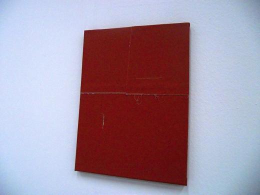
SAMBA was also the choice of colors for this minimalist painting displayed at Autocenter as part of their “One From None” show. Eva noted in her post that this exhibition allowed young artists to use their work to externalize aspects of their personality. Was this their attempt at showing their anger, energy, or sexuality? Or was this their pledge of allegiance to the Pantone palette?
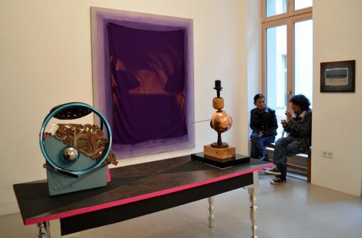
“Recognize Set In Free Edge” at Galerie Christian Ehrentraut also prominently featured the Pantone palette. The piece below mixes the same ACAI- KOI combination that Meg Cranston popularized at her opening, swirling the colors like peanut butter and jelly (maybe literally; Adela did not note the materials for this one). Also notable is the garish hot-pink lining of the table, which could have easily been blended more stylishly with a dose of DEVOTION.
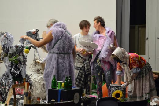
"Gelatin" at Spavillion featured men dancing around birds and ballons on the opening night of Berlin Art Week. While the prancing through rubbish might not please everyone, one element of the perfomance was classically tasteful: their outfits (underwear?) are distinctly light ACAI. I think we might have found Pantone's new press photos!
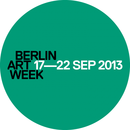
Finally, when Berlin Art Week announced their use of “#berlinartweek” as a social media function, their tone was decidedly “trendy”. Naturally, I wondered if their logo had followed the advice of Pantone’s latest palette—
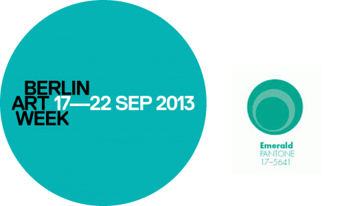
It’s a very, very, very loose interpretation of Pantone’s EMERALD, but even #berlinartweek found themselves falling for the Pantone forecast. However, since “close only counts in horseshoes and hand grenades” as many wise and trustworthy people have told me (no one has ever said that to me in real life), I have taken the liberty to adjust Berlin Art Week’s official logo in retrospect to save them the embarrassment of their slight misinterpretation of the palette.
I accept your thanks in advance; please send all proceeding monies to the address listed on our Contact page.