Paola Antonelli on Design and Violence
Paola Antonelli on Design and Violence

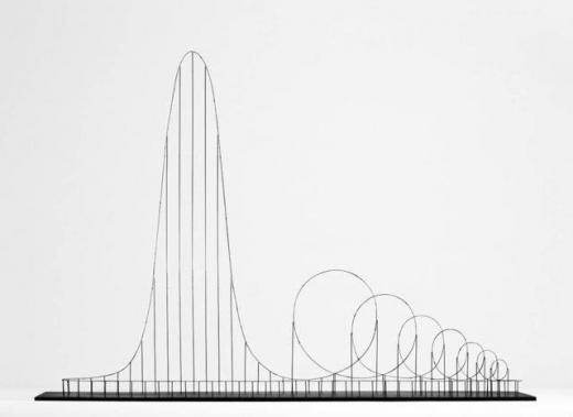
We often think of design objects as something positive or beautiful. Something to make our lives easier and more comfortable, like the Eames Chair or the iPhone. But what about AK-47s, Euthanasia Rollercoaster, or the Stuxnet digital virus? Those are as much design objects as aforementioned classics.
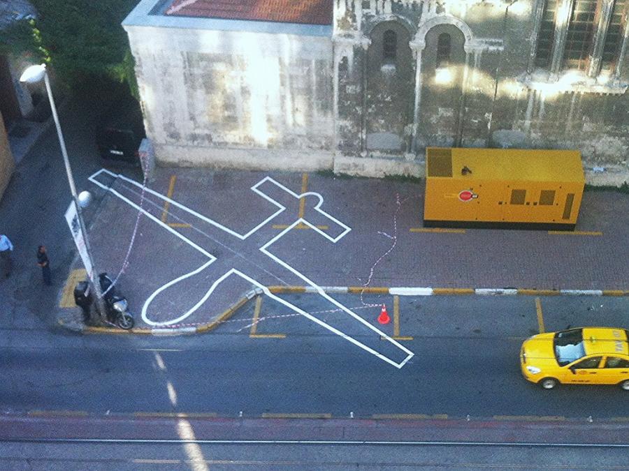
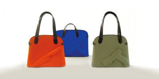
Design can be an instrument for evil destruction, power and control. However, violence inherent to design objects is often hard to recognize, Paola Antonelli argues. On her blog “Design and Violence” the MOMA curator explores the hidden violent character of an array of objects and architectures. Amongst them are handbags, a stiletto heel, and the shadows of drones. The selected items are accompanied by essays from critical thinkers, artists, and journalists.

Euthanasia Coaster (2010) by Julijonas Urbonas

The Guardian Angel Handbag by Carolien Vlieger and Hein van Dam
We got the chance to briefly interview Antonelli when she was speaking about her project at the Tech Open Air in Berlin.
How did you initially start the project Design and Violence?
As always, projects about contemporary design start from reality. Design is about reality. So in the past I did an exhibition about safety which was like three years after 911. I also did an exhibition about interface design and right now I did it about violence. There’s a strange mood in the world right now. Violence comes in so many different forms. In form of racism, sexism and discrimination against immigrants. At the same time there is this idea of nationalism and people wanting to separate from existing coalitions, like the Brexit right now. I felt I needed to talk about it somehow. And the only way I know to talk is through design objects. So I used design objects to talk about violence.
You started to explore the relationship between design and violence on a WordPress blog. What would you say are the opportunities for making an online exhibition?
It’s not an exhibition anymore. As curators we are tired to this idea of the gallery, of the space. Spaces are important, but there is a place and a mise en scene for everything. When you want a real dialogue, a back and forth, there’s nothing better than open internet. It would have been too much to do it on Facebook or on Twitter, because I wanted to have a little bit of design. WordPress is very basic and that’s what I needed. I was able to have a dialogue that I couldn’t have had in a gallery.
Did you have any new experiences with curating in such a way?
Yes! First of all I didn’t really speak about it, because it was internal to the design world. There was one of the objects that we published that sparked so many discussions in the design world about critical and speculative designs. There are designers that do not make objects that you can use right away, but rather they build scenarios around objects that talk about the possible consequences in the future or our choices of today. So it is very speculative. When you are online you can really influence the discourse. You can influence it in the scholarly academic circles and you can influence it in the wide world. For instance Peta, or vegans, there was a gigantic discussion. It was interesting to see first of all how it works and how people want to speak. And second how many different tribes there are that want to talk about their matters. And third how generous people are when you propose to them something worthwhile.
* * * * *
Antonelli’s WordPress blog has been turned into a website hosted by MOMA. Furthermore a book on Design and Violence got published by MOMA last year.